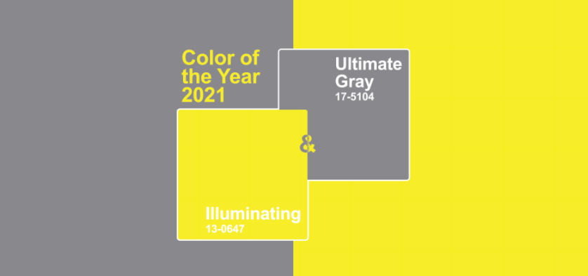
Color of the Year 2021
Some artists could care less about Pantone's Color of the Year 2021. Granted, what Pantone chooses each year does not have any direct affect on what I design for my clients. What I love about this arbitrary decision though is the conversation it creates and the platform it becomes for creativity. That is especially true this year.
This year, for the first time, Pantone chose two colors: Illuminating (13-0647) and Ultimate Gray (17-5104). This color choice aroused a lot of criticism from my designer friends in the wedding industry. Grey and yellow? So 2010. Grey is no longer on trend and yellow can be garish, especially as a primary color in a palette. So why did Pantone choose grey and yellow for the 2021 color of the year? They call it, "a marriage of color conveying a message of strength and hopefulness that is both enduring and uplifting." The yellow is like the light at the end of a dark, grey tunnel. We shall call this tunnel the year of 2020.

Although Pantone's choice received disapproval from many, these difficult to reconcile colors create a wonderful design challenge for an artist like myself. In order to peacefully unite these colors, the full color story of the design becomes extremely important. I love a design challenge. It's when we become truly creative. This year, Pantone pitched a curve but I think we knocked it out of the park through our interpretation below. Never be afraid to experiment and to test your limits.
Pantone inspired studio shoot with Emily Kaye Floral
To view work inspired by Pantone's 2018 color of the year, Living Coral, enjoy this unique use of peonies.
This project was styled by Emily Kaye Floral Atelier, photographed by Abigail Lewis Photography, modeled by Anne Marie at W Road Collection, with dress and accessories from Anthropologie.


